
Sunday, December 5, 2010
Sonogram
Periodic Table

Plane map projection

This type of map projection is used to display the poles on a map. The projection is created from a top view at either pole. The example seen above shows where the projection is made from. http://www.kidsgeo.com/geography-for-kids/0031-map-projection-types.php
Werner projection

Mercator Map projection

Star maps

Aviation maps

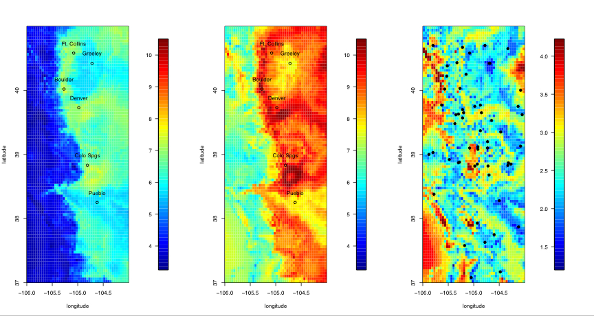
Climate Map

Star plot

Correlation Matrix
Similarity matrix

Stem and leaf plot

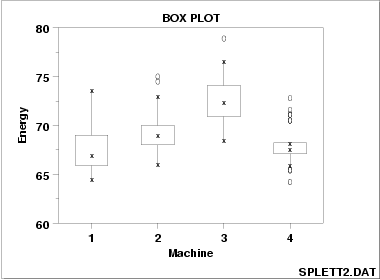
Box Plot
Histogram

Triangular Plot

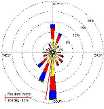
Windrose
Climograph

population profile

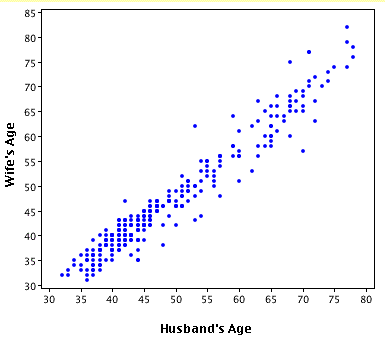
Scatter plot
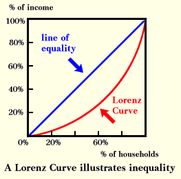
lorenz curve
Bilateral graph

isobaths
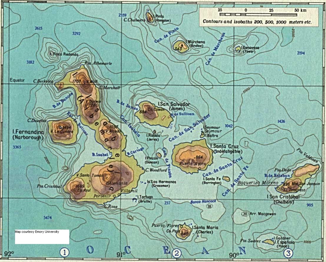
Bathymetric maps

Continuously variable proportional circle map
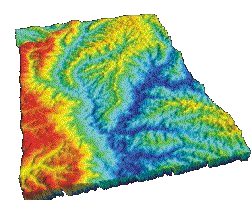
DEM
DRG

Isopleths

Isopach

Isohyets
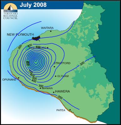
Isotachs

http://www.underthemeso.com/blog/?m=200702
Isobars

http://www.newmediastudio.org/DataDiscovery/Hurr_ED_Center/Hurr_Structure_Energetics/Closed_Isobars/Closed_Isobars.html
LIDAR

Doppler radar

Black & white aerial photo
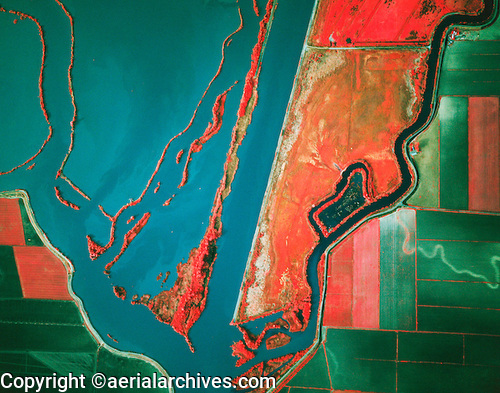
Infrared aerial photo
Statistical maps

Cartograms

Flow maps

Isoline Map

Proportional circle maps

Choropleth maps

Dot distribution maps

Propaganda maps

Hypsometric maps

PLSS maps

These maps are created by the Public Land Survey System that is established in the United States. The PLSS makes maps by using a specific system that organizes all the information in a way that allows people to easy find the information that they are looking for. In this PLSS map one is able to see the town ownership of Flathead County Montana. http://flathead.mt.gov/gis/plss.php
Cadastral maps

Thematic maps

Topographic map

A Topographic Map can display the same information that a phannimertic map can display but it also includes vertical information. One is able to look at a topographic map and see the various elevations that a given location can be situated on. In this topographic map one is able to see the elevations that on the various locations in Ha Ha Tonka State Park.Map Source
Planimetric map

Map source
Mental Map

Map Source
Subscribe to:
Posts (Atom)